


It's not often I document the entire journey of a scroll, not because I don't want to I do, but rather because I get so caught up in the work I just forget. However, this is one of those scrolls that has its entire life ( more or less) mapped out by pixels.
For me it always starts with my books. I spend hours pouring through them to find something that inspires. I like doing this with books rather than online digitized manuscripts because I can read the books in my studio with ease. prop the books open at my work table and get in really close to have a good look. I find that harder to do with the computer, especially since the main computer is no where near the studio and up until very recently we only had a black and white laser printer that's around 7 years old. Finding examples online, while very cool was very impractical for me to use now I have a different colour printer that might change somewhat.
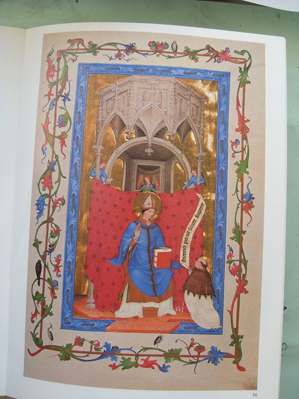
You can see in the 1st pictures the inspiration for the scroll. I didn't copy it 1:1 instead I took the general design ideas and made them something more personal to the recipient.
After finding inspiration comes the paper, it takes a while to decide how big it should be. This is usually determined by the type of illumination and the amount of text and the text it usually what ever I have on hand that works and is not so convoluted that my brain does twists. In this case it is a fairly standard SCA GoA text. While, I really like the period texts that people write and have used them when I can, sometimes I think it's also nice to have something traditional to the SCA and something that keeps God, saints etc. out of the equation. Plus I don't always have time to wait for someone to write me a period text and I have also had some complaints about more period texts being too long, too wordy and too full of religious "stuff." It's hard to please everyone all the time with the texts so often this is why I stick to the basics.
Once the size has been figured out, I take the paper and I line it out. This is done on my big drafting table with the built in rulers and my ames lettering guide. It usually takes around half an hour because I already know in my head how this will look. Once the lines and spacing is all done I start to sketch out the illumination.This is done with a Faber-Castell "H" pencil. I don't use any other kind of pencil for my scroll work and I like "H" because it's still soft enough to erase easily but hard enough it doesn't get graphite everywhere and smudge.
After the pencilling I ink.I love the inking process. I love using a dip pen to draw with.
Once the design is inked out I usually do the calligraphy this is because if I am going to screw this scroll up this is the time it will happen. It's a rare scroll for me that doesn't have some sort of typo but I've learned over the years how to effectively fix mistakes made in the calligraphy but just in case I almost always do the calligraphy before any illumination or gold.
Once the calligraphy is done, then I gild.
The gesso for this scroll was a gum arabic - sugar - water mix. It's a great gesso actually because it allows for both flat and raised gilding. You can also see that I was able to tool the gold in the B. Pinpricks using a bookbinder's awl.
After the gilding is done then I paint.
For this scroll I decided to use colours that matched the device of the recipient using the red to counter balance the blues and blacks. Acanthus leaves are a struggle for me so this was a lot of work trying to get it right. Mostly I'm happy with the end result because the overall piece is pleasing top the eye. It's a simple but very elegant design, deceptive in its simplicity actually because it took a long time to get right.
It's fun to go back and see the step by step progression, reminding me I should document it far more often than I do.
Watercolour, gouache on pergamenata, with oak-gall ink, 23kt gold transfer leaf.
No comments:
Post a Comment